Company overview
ekar is the Middle East’s first and largest personal mobility company, providing users on-demand access to a network of thousands of carshare and subscription leasing vehicles, and other mobility options all within its ‘Super App’.
ekar provide 2 rental services such as Instant booking and home delivery. Instant booking let you pick up ekar’s car nearby, and drive it with pay-as-you-go policy. Home delivery let you subscribe selected car and will be delivered to your home.
Design Approach
👂🏻 1. Understanding
Define the root cause of the problem by empathizing and understanding user needs, motivation, and pain points.
💡 2. Ideation
Generate ideas together to solve the problem which intersect with usability, feasibility, and viability.
✍🏻 3. Execution
Turn ideas into final design so we can develop, and ship it to real users, then measure its impact.
👂🏻 Understanding
Stakeholder Discussion
To understand business problem and stakeholder expectation, I had discussion with Product team. To have better understanding about the metric, I initiatively checked the data of monthly conversion rate. This resulting an insight that our conversion rate is 6.69% in June and we want to increase it by improving the booking journey.
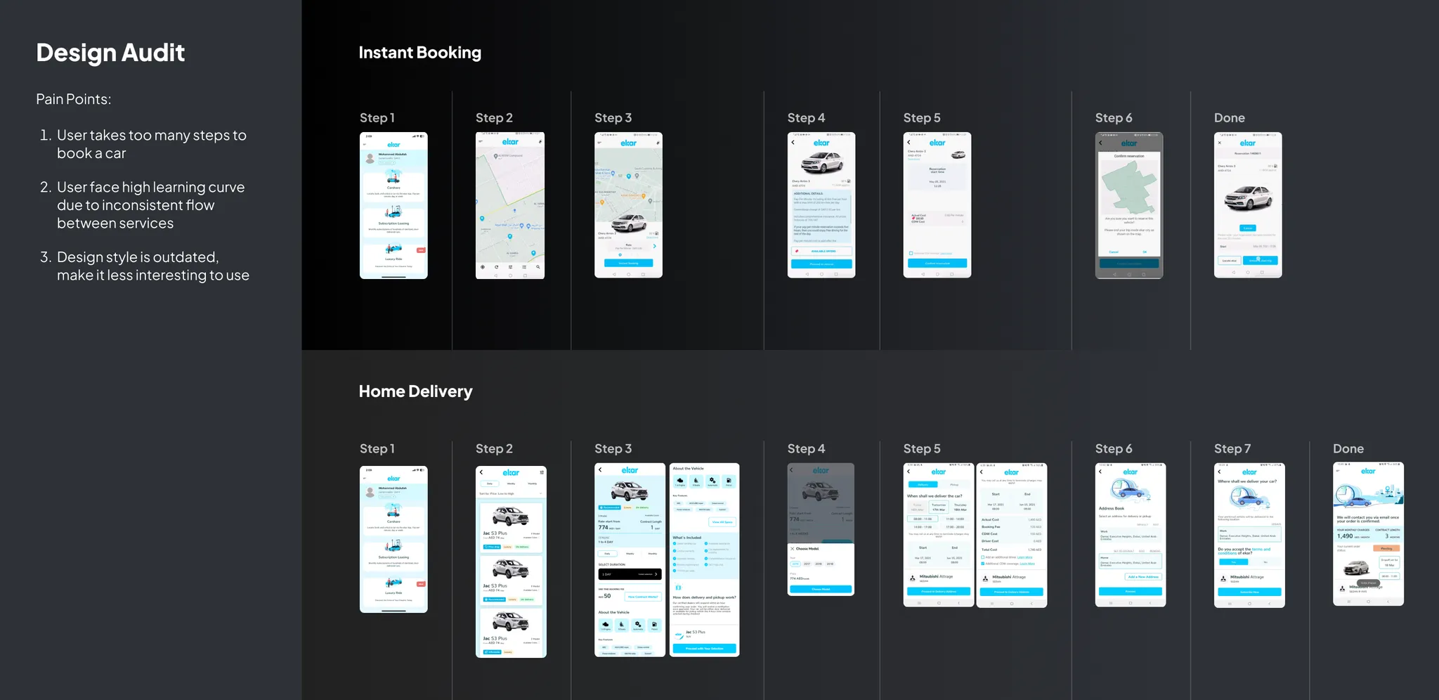
Design Audit
We have very limited time and resources to perform proper user research. So I proactively perform design audit instead, resulting pain points findings such as inconsistent flow and to many step to complete booking.
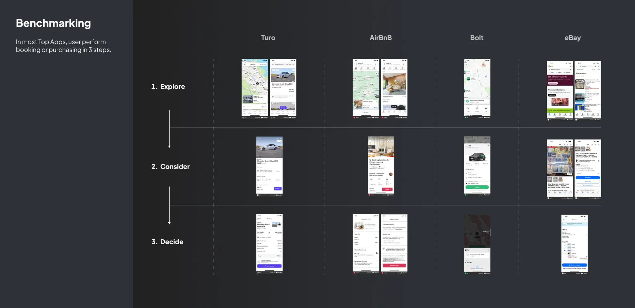
Benchmarking
since the journey wasn’t ideal, we benchmarked booking or purchasing journey from top apps. This gave us insight that completing booking or purchasing in 3 steps is common mental model.
Conclusion
💼 Business Problem
- our booking conversion is very low, leading to low numbers of booking. Therefore it’s hard to achieve revenue increase
🙍🏻♂️ User Problem
- our 2 car-rental-services have inconsistent flow. this leads to high learning curves between services
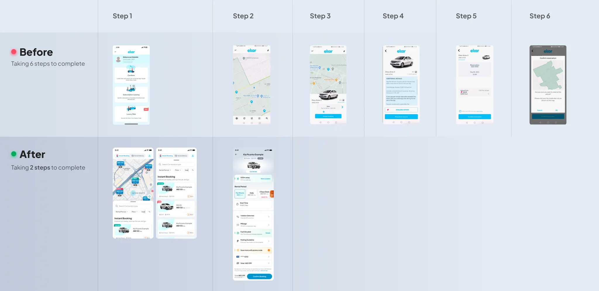
- user need to perform so many steps to book a car. (6 steps at least)
- Design style is old-fashioned, might leads to lack of user interest and trust
🎯 Design Goal
- create most simple and familiar booking journey, as simple as book a hotel or buy e-commerce product
💡 Ideation
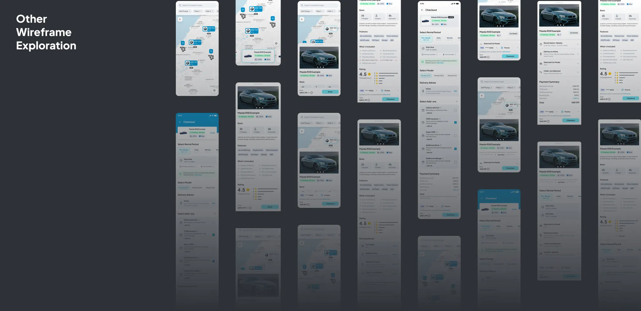
To achieve design goal, I explored various ideas of flows and wireframes. This generates several breakthrough ideas to solve user problem
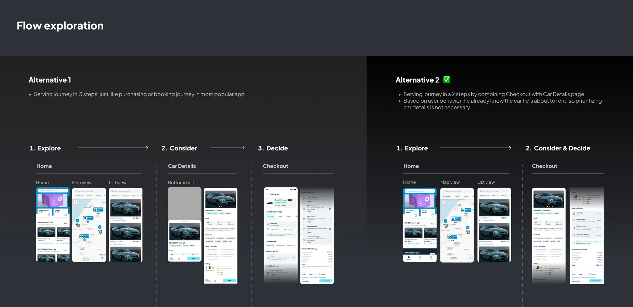
Flow Alternative 1: I drafted 3-steps-flow as an adoption of booking journey from top apps based on benchmarking result.
Flow Alternative 2: Then I found a way to extra-simplify the step by incorporating car details inside checkout, so the flow contains 2 steps only. This can be done due to user behavior, where user has been familiar with common car in the street. Therefore, providing a stand-alone car details page is no longer necessary.
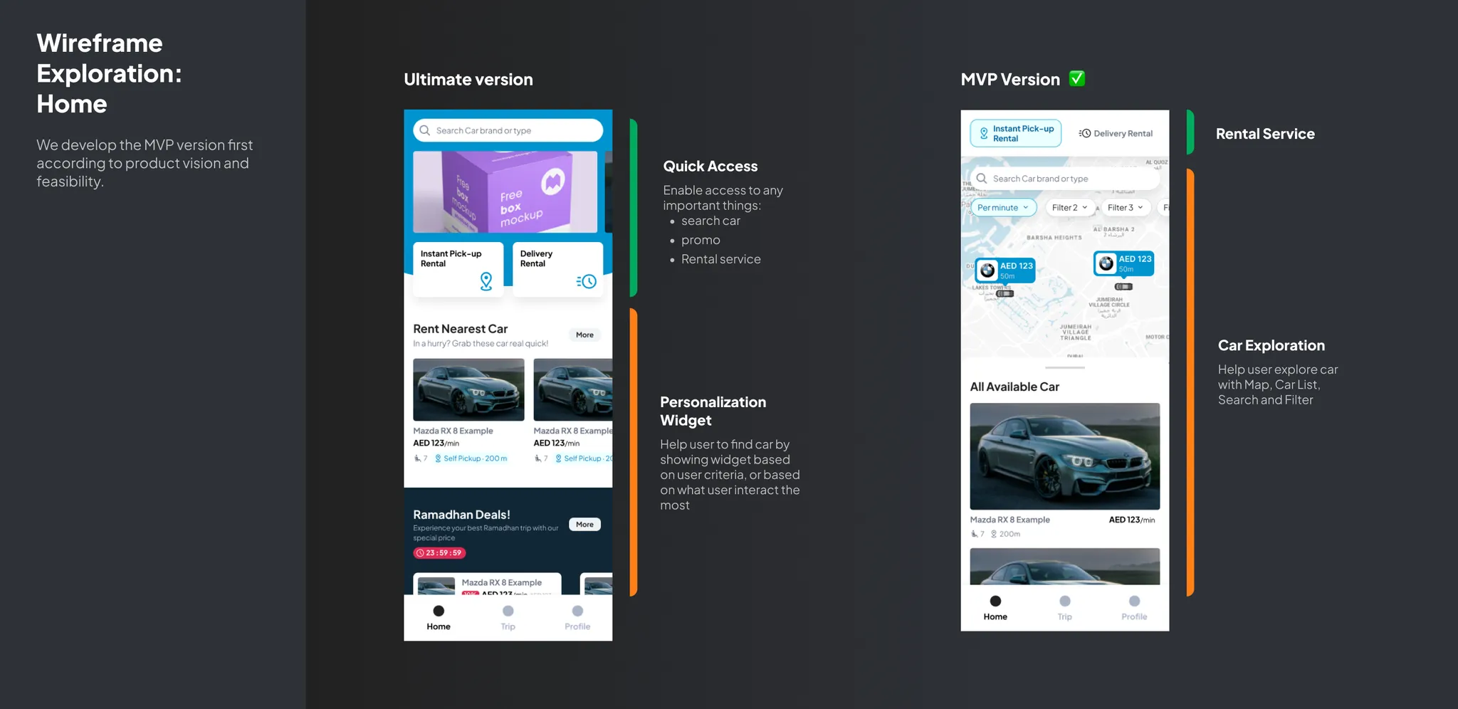
The ultimate version has Personalization feature to help user explore car based on his personality. MVP version adopts map app layout with classic car listing and showing instant service as a default.
Based on discussion with Product Owner and Head of Product, we would implement MVP version firstly because we wanted to focus on Instant Rental as the most popular service. We also still preparing our technology for providing Personalization algorithm of ultimate version in the future.
✍🏻 Execution
Challenge: Users had to navigate an extra step to browse car listings, creating friction in their search.
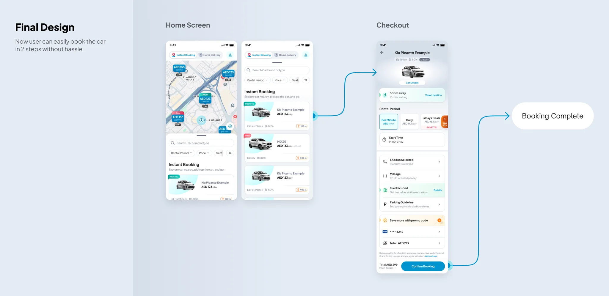
Solution: I streamlined the experience by integrating car listings directly onto the homepage, enabling instant exploration. To ensure intuitive exploration, I incorporated familiar design patterns from leading travel and transportation apps, prominently displaying search, filter, and sort functions. This aligned with users’ existing mental models, making the features easily discoverable and improving usability.
Challenge: Inconsistent user journeys between our rental services created confusion and a steep learning curve.
Solution: I unified the booking process, reducing the steps from 6-7 to a streamlined two-step flow. Key design decisions included consolidating booking preferences onto a single checkout page, integrating car details within the checkout page, and pre-selecting required fields. This streamlined experience significantly increased conversions and the number of successful bookings.
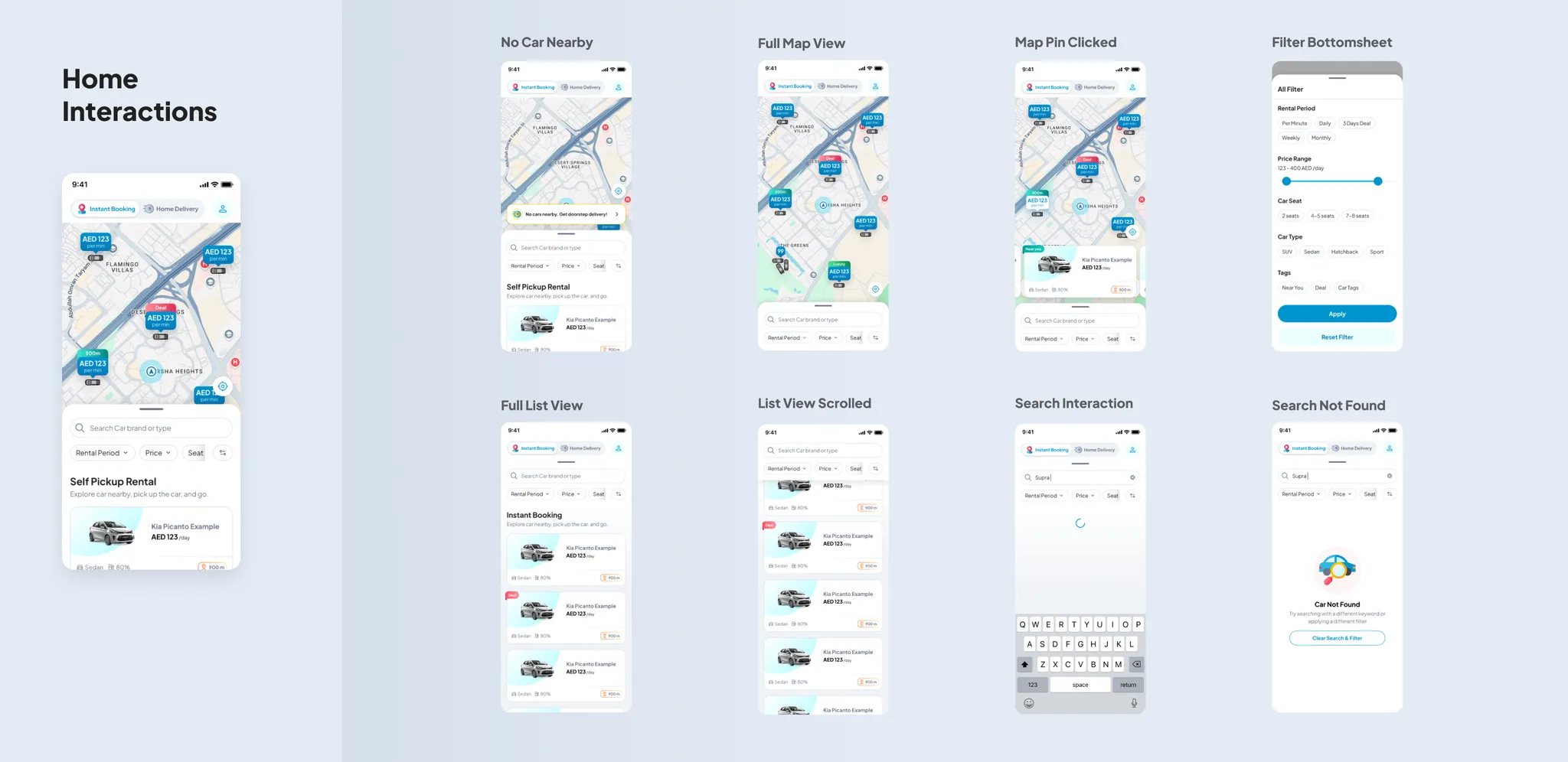
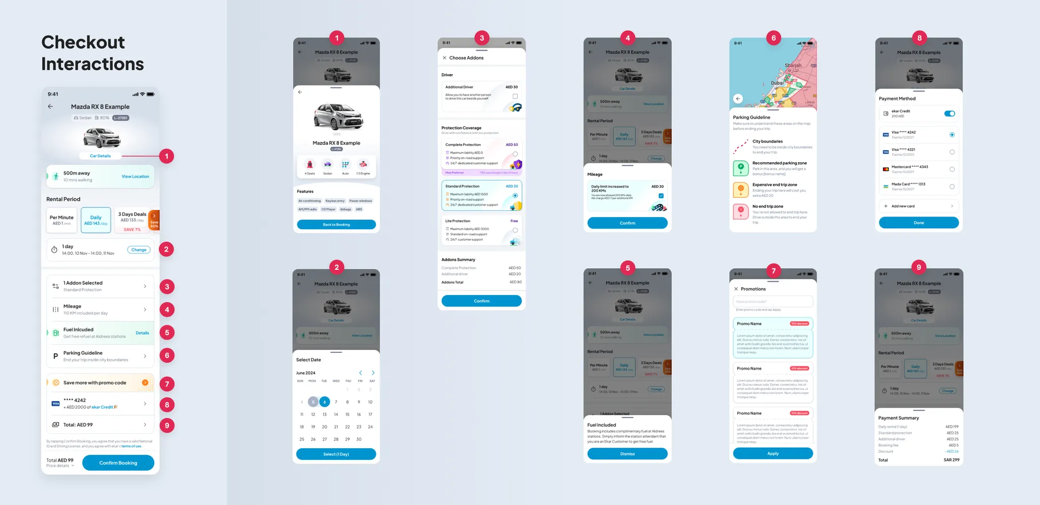
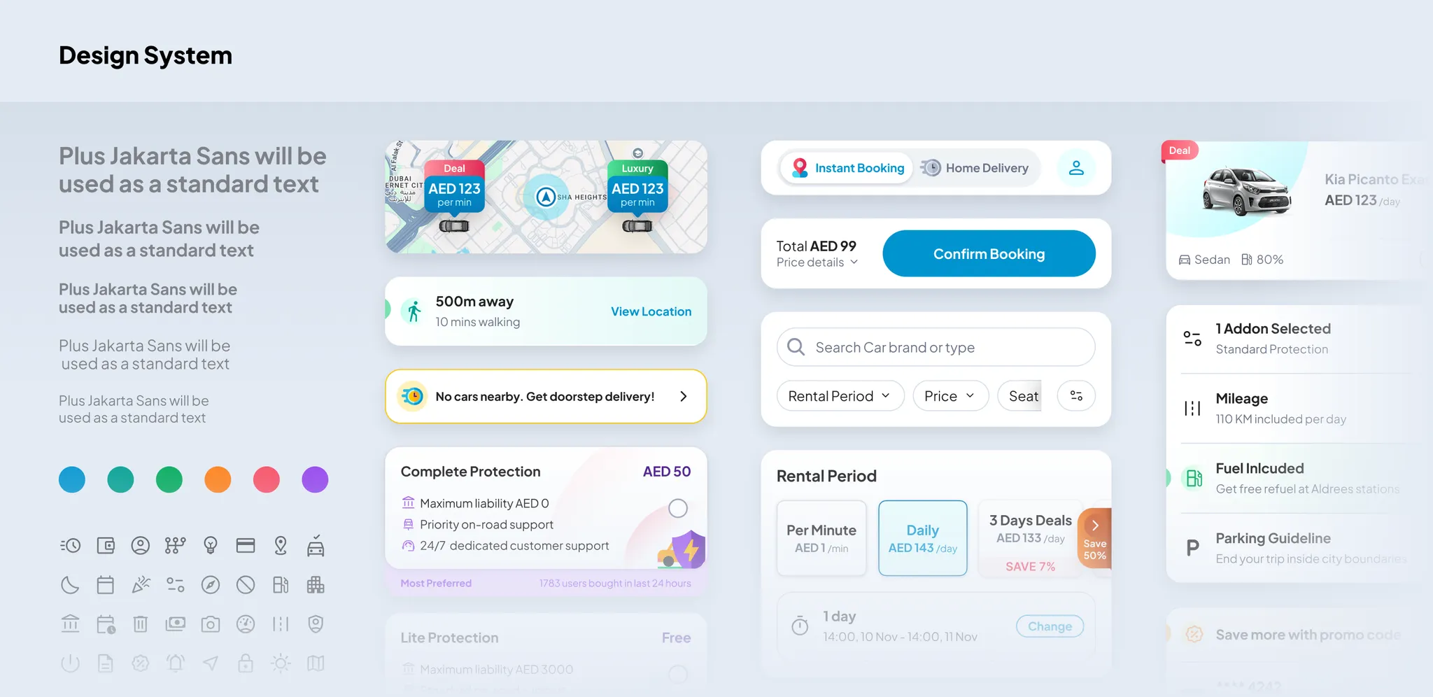
Old fashioned, undocumented previous design language leaded to slow design crafting and unexciting visual. So I created new design system, enabling faster design crafting. Revamped design language also results a cleaner, bolder, and more lively visual, aligned with company’s design direction.
Impact

By streamlining booking journey from 6 steps to 2 steps flow, the conversion rate increases by 20,24%. This also increase the number of booking by 21%. And as the user experience improves, active session increases by 13,6% with no marketing campaign.*
*conversion rate and number of booking are based on data in the period of August-December. Active Session is based on data in period of August – October
